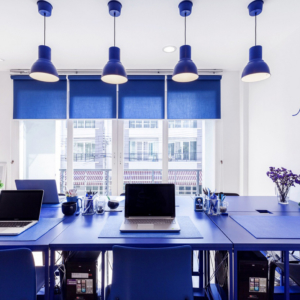
What defines whether a colour is stimulating or soothing is not the colour, it’s the intensity. A strong bright colour will stimulate, and a colour with low saturation will soothe – Angela Wright, Colour Psychologist
Studies show that colours affect our perception, are related to the cognitive area, bringing sensations, stimulating or discouraging according to the use of them in the conviviality. Colouring your work environment can make a great impression on visitors, just like the furniture you choose, the colours pass a very perceptive visual and sensory identity.
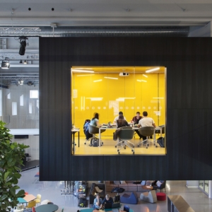
Yellow
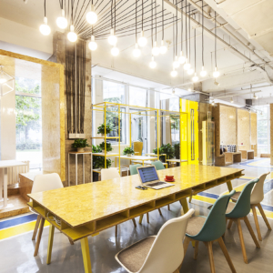
The yellow colour is indicated for cold environments with low light, for being a clear and lively colour, emanating lustre throughout the environment and warming it, yellow conveys security and hope, is jovial, liberated and positive. It corresponds to knowledge and wisdom. Attributes such as reason, logic, intellectuality, discernment and decision-making are favourable to yellow tones. Creative environments have many shades of yellow. Stimulating receptivity and increasing attention to detail is a colour that can be employed in small objects and still draw much attention.
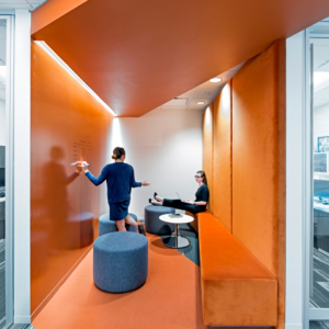
Orange
Orange is perfect for cold and damp spaces, it is antidepressant and gives strength, invigorating and stimulating, but without much dynamism. It refers to brave and adventurous, enthusiastic and zealous, it gives a sense of energy. Orange is the colour of affirmation and joy, stimulating conversation and sense of humour. Joy, enthusiasm, hope and disposition. It fights fatigue, improves air flow and increases optimism.
Needing a professional to add a touch of colour to your office? Contact our painting experts for a Free Quote
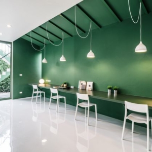
Green
The green adepts to spaces warm and with little ventilation for being a cold and raw colour. Green energy reflects participation, adaptability, generosity and cooperation. This colour attenuates emotions, facilitates correct reasoning, and broadens awareness and understanding. He passes security, protection, decision. With a great sense of space, freedom, harmony and balance. With natural look of green. This colour reminds us of life and its higher vibration reflects the feeling of raw. The colour green produces a sedative and relaxing effect, although it can cause drowsiness, fatigue or irritability, if not used correctly. this colour helps people create a balanced, soothing and calming environment around them. It symbolizes harmony and balance. It is considered a natural colour of balance and reduces tension.
Beige
Use Beige for multipurpose cold spaces. Combined with other colours, it gives the feeling of warmth and makes the environment neutral. Neutral colours are perfect for bold décor; Do you want to warm the environment? Try to paint the ceiling (which is casually white) of beige. Beige is the clearest and opaque hue of yellow, it is linked to our cognitive sense of warm places, that is, use beige and have a more welcoming place, warm colours stimulate creativity, comfort and cause agitation. Try to use the beige in tone gradient scale.
White
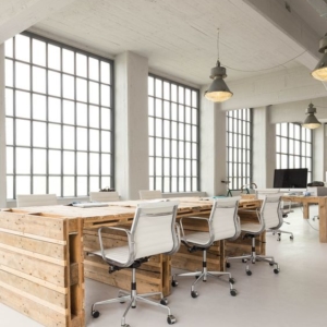
Impersonal provides brightness if combined with other tones. Associated with cleanliness, purity and innocence. White is used as a colour suitable for the purest spiritual feeling. This is the colour of detachment. White is the mixture of all colours in the lighting scale, causes freshness, purity and sincerity. It is used to obtain peace of mind, harmony and balance. A colour that goes back to the casual end. White is chic and always trendy, Looking for a neutral environment? Use White and emphasize decoration items, if you like colours, apply a decoration with strong colours and contrast with white.
Paint Melbourne wants you to know that not every customer wants or needs our colour consultation services, but it’s another service that we do provide to help make it the best experience you can have with painting your home or office interiors. Contact our painting experts for a Free Quote
Red
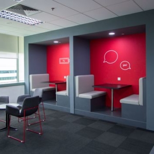
Red is the colour of motivation, activity and will. Red is associated with heat and excitement, with the initiative and willingness to act, with the spirit of pioneering that elevates us. Persistence, physical strength, stimulation, and power are its typical traits. Affection and forgiveness are two beautiful qualities of this colour, as well as prosperity and gratitude. Physical love and carnal passion are synonymous with red. Anemone of restlessness, depending on the tone, will refer to terror, fear, must be used without exaggeration, unadvisable to cover extensive part, formerly used in house walls, in the last century where they hid the soot grime from fireplaces and wood stoves. It increases attention, it is stimulating, it is motivating. Indicated to pass heat and energy, passion, strength, vitality. It is a colour that awakens the sense of competitiveness, stimulates the blood circulation and opens the appetite.
Blue
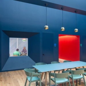
The colder, blue colour sends deep oceans, ice, water, sky, you can say that passes the colour of silence. This colour is part of the cold spectrum and, by its quietude and confidence, promotes devotion and faith. Blue is a popular colour associated with duty, beauty and skill. The serenity of this colour brings with it peace, confidence, and pleasantly relaxing healing feelings. His fluidity and serene strength are attractive traits that arouse admiration from other people. Tranquillity and even solitude. This colour is not threatening, valuing loyalty and honesty. It has great power of attraction, is neutralizing in the restlessness of the human being, calms the individual. Sincerity, sensitivity, independence and tradition. It increases tranquillity, relaxes muscles, is the colour of meditation.
Black
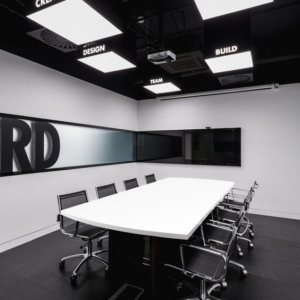
The black colour is almost always the colour of death, mourning and penance. In general, this colour is used by people who reject society or rebel against social norms. Black is a colour that negates light despite being the complete physical joint of colours. Black reflects authority, respect, power, luxury, ostentation, struggle, fears, obscurity, neutrality, opposition, simplicity. Black is perceived as dark and mysterious. It is expressive, rich and harrowing at the same time. It is a frequent colour, black can pass the idea of safety, a colour that never goes out of style. Depending on the use of this colour can be a beautiful choice of decoration, objects, furniture and black details will never let pieces go out of line. It should be used with caution by closing the environment.
Purple
Wisdom, philosophy, sophistication and contemplation. Stimulates spirituality and eliminates astral impurities, Related to mysticism, the colour of the question. It refers to questions, doubts, the unconscious and mysterious knowledge. Colour of sour fruits. Cold colour depending on the tone can fill an environment by closing it. It is the colour related to logic, to thinkers, the colour purple is associated with witches, magicians, masters, people of high intellectual level, purple can pass sorrow and melancholy if not well used. Purple is a childlike and playful colour in light tones. Simple blending with other colours, it is located in the mixture of blue and red (cyan and magenta), its contrast should be used with colours such as light yellow and light green.
